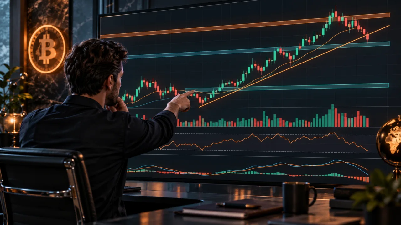
But first, you need to know what you are looking at.
A red 15-minute candle does not mean that a crypto asset has entered a bear market. Bitcoin trading below its 50-period moving average on a five-minute chart tells a very different story from BTC trading below its 50-week moving average. A rally backed by heavy volume also carries more weight than a move taking place in an almost empty market.
As 2027 approaches, the tools available have become extremely sophisticated. TradingView lets users switch from line charts to candlesticks, bars, indicators and multiple timeframes. Binance combines candlestick charts with market depth and the order book. CoinGecko makes it possible to examine not only a crypto asset’s price, but also its market capitalization, trading volume and the market as a whole.
The challenge is no longer getting a chart.
It is knowing which information is actually worth watching.
Cryptocurrency charts: what do they represent?
The first thing to understand is that a chart depends on the market being observed. On a crypto exchange, for example, BTC/USDT represents Bitcoin’s price in USDT on that specific pair. BTC/EUR shows the price in euros. BTC/USDC uses USDC as the quote currency.
A chart is therefore never simply “Bitcoin.”
It represents an asset, a trading pair, a data source and a timeframe.
The distinction may seem minor when markets are highly liquid, because price differences between major platforms are often small. It becomes much more important with smaller cryptocurrencies. A token may have a liquid market on one exchange and almost no volume on another.
The chart also depends on the type of data being displayed.
A standard line chart may connect only closing prices.
A candlestick shows four different prices for each period.
A market-capitalization chart represents the estimated total value of the circulating supply.
A dominance chart measures a crypto asset’s share of total market capitalization.
A volume chart indicates the intensity of trading activity.
Before interpreting anything, ask a very simple question: what exactly does this axis measure?
Many chart-reading mistakes begin before technical analysis even starts.
The line chart remains the simplest option
The line chart is probably the best place to start.
A line generally connects the successive closing prices of a crypto asset. TradingView also allows users to use the open, high, low or different average prices as the source, but the close remains the standard setting.
Its main advantage is visual.
The noise disappears.
A five-year Bitcoin chart is much easier to read when it contains only one line.
The major rallies, corrections and peaks become immediately visible.
This format is particularly useful for investors seeking answers to broad questions.
Is BTC higher than it was three years ago?
Is Ethereum approaching its previous high?
Which crypto asset has performed best since January?
TradingView also notes that line charts are particularly practical for trend analysis and comparing several assets on the same chart.
Its weakness is the exact opposite.
Simplification removes information.
A line connecting two closing prices does not necessarily show the range covered during the period.
Bitcoin could open at $80,000, briefly fall to $75,000, rebound to $82,000 and close at $80,100. A simple line might make the day look almost unchanged.
The candlestick would show the entire battle.
Candlesticks show four prices in a single candle
The candlestick chart, or Japanese candlestick chart, has become the dominant format among crypto traders.
Each candle corresponds to a defined period.
One minute.
Five minutes.
One hour.
Four hours.
One day.
One week.
Binance notes that a standard candlestick contains four fundamental data points: Open, High, Low and Close, often abbreviated as OHLC. The body shows the difference between the open and close, while the wicks represent the extremes reached during the period.
Consider a fictional daily Bitcoin candle.
Open at $85,000.
High at $88,000.
Low at $83,500.
Close at $87,000.
The body represents the move from $85,000 to $87,000.
The upper wick shows that BTC reached $88,000 before pulling back.
The lower wick shows that it had fallen as low as $83,500.
In a single candle, the trader can therefore see an entire day of confrontation between buyers and sellers.
That richness explains the format’s popularity.
It also explains why charts can quickly become intimidating for beginners.
One hundred candles mean four hundred main prices, before volumes and indicators are even added.
The goal is not to interpret every candle in isolation.
Start with the structure they form together.
A green candle does not necessarily signal a rally
The color of a candlestick generally indicates the relationship between its open and close.
If the close is above the open, the candle is usually displayed in a bullish color.
If it is below, the candle appears in a bearish color.
Colors can be customized. Green and red are therefore not intrinsic properties of Bitcoin.
More importantly, a green candle is not a forecast.
It describes what happened during a given period.
A daily candle can be green in the middle of a six-month downtrend.
A red candle can appear in a powerful bull market.
A long lower wick may indicate that buyers reacted strongly after a sell-off. It does not guarantee that they will do the same thing the following day.
Candlestick patterns were developed to interpret certain recurring configurations.
Doji.
Hammer.
Engulfing.
Shooting star.
Morning star.
The problem begins when each pattern is used as a standalone signal.
TradingView notes that patterns become more relevant when combined with other technical information, and that no visual configuration can determine the next price trajectory with certainty.
Context remains more important than the candle’s name.
Timeframes can completely change the story
This is probably the most important concept after candlesticks.
The timeframe indicates how much time each candle represents.
On a one-minute chart, a candle contains one minute of price action.
On a one-hour chart, each candle represents sixty minutes.
On a one-day chart, it represents twenty-four hours.
A crypto asset can therefore be bullish on the weekly chart and bearish on the 15-minute chart.
There is no contradiction.
Suppose Bitcoin rises from $60,000 to $90,000 over several months.
The overall trend may remain bullish.
During a single day, BTC can fall from $89,000 to $86,000.
The 15-minute chart temporarily turns bearish while the weekly chart retains its bullish structure.
The timeframe must therefore match the objective.
An investor planning to hold Bitcoin until 2030 probably does not need to make a major decision based on a three-minute candle.
A day trader cannot rely solely on the monthly chart to plan every entry either.
TradingView illustrates this difference in its screener: a one-day view may use five-minute intervals, while a five-year period uses monthly candles.
The longer the timeframe, the less important small fluctuations become.
Starting with a higher timeframe reduces noise
A simple approach is to read the market from the top down.
For an active trader, this can mean starting with the daily or four-hour chart to understand the broad direction.
Then move to the one-hour chart.
Finally, use 15-minute or five-minute charts to refine an entry when necessary.
This approach helps avoid a common trap: mistaking a small correction for a major reversal.
The higher timeframe provides context.
The lower timeframe provides greater precision.
A long-term investor can apply the same principle across other horizons.
Monthly.
Weekly.
Daily.
There is no need to multiply the number of screens.
Three well-understood timeframes are better than nine charts telling nine different stories at once.
The historically volatile behavior of Bitcoin makes this discipline particularly useful. A striking move over 15 minutes can become almost invisible over five years.
Changing the timeframe helps put emotion back in its place.
A huge red candle looks less dramatic when it represents only a small correction within a multi-year advance.
Conversely, it may reveal a genuine breakdown when it destroys a structure visible on the weekly chart.
Trend comes before indicators
Adding ten indicators to a chart is pointless if you do not know which direction the market is moving in.
The initial reading should remain simple.
Is the price forming higher highs and higher lows?
The trend is generally considered bullish.
Are the highs and lows declining?
The trend is more likely bearish.
Is the market moving between two zones without a lasting direction?
That is more consistent with a range.
TradingView also defines an uptrend as a succession of rising highs and lows, a downtrend as the opposite, and distinguishes a sideways phase when the price remains within a range.
This structure already provides a great deal of information.
A trader buying every dip in an uptrend is following a different logic from someone buying the bottom of a range.
And buying during a downtrend because “it has already fallen a lot” is not confirmation of a reversal.
A trend line can then help visualize the move.
It should not be forced to produce the desired conclusion.
Two people may draw different lines on the same chart.
The price remains the same.
That is why actual highs and lows should take priority over the drawing.
Support and resistance are often zones
Support is an area where buyers have historically managed to slow or stop a decline.
Resistance is an area where sellers have more effectively contained an advance.
TradingView describes them as local levels where price encountered lower or upper limits during a given period.
The important word is “area.”
Beginners often draw a line at $80,000 and assume that Bitcoin must rebound at exactly $80,000.00.
Real markets are less tidy.
A zone between $79,500 and $80,500 may be more relevant.
The price may briefly move through it.
Create a wick.
Then reverse.
It is also important to consider how many times the level has been tested.
A repeatedly tested resistance may indicate strong supply.
It may also gradually exhaust sellers.
A breakout sometimes turns former resistance into support, but again, the market is not required to produce a perfect retest.
Technical levels are areas where a decision becomes interesting.
They are not physical walls.
The way a blockchain and its transactions operate does not change because a horizontal line has been drawn on TradingView. The level exists in market behavior, not in the protocol.
Volume gives the move more weight
Price shows where the market is going.
Volume helps show how much participation is behind it.
A resistance breakout accompanied by a clear increase in volume does not mean exactly the same thing as a breakout occurring during a very quiet period.
Volume represents the amount traded according to the conventions of the platform and market.
You should therefore always check its source.
BTC/USDT volume on one exchange is not automatically Bitcoin’s global volume.
TradingView also offers a relative-volume measure that compares current volume with its historical average. Its documentation describes Relative Volume as volume divided by average volume, with a standard reference based on previous periods.
This comparison can be more informative than the absolute figure.
An altcoin normally trades $50 million per day.
It suddenly reaches $600 million.
Something has changed.
Conversely, a very rapid price move on unusually low volume calls for greater caution.
Volume still does not say “buy.”
It helps assess whether many participants appear to be backing the move.
On a well-constructed chart, volume bars are therefore often more useful than a fifth complicated oscillator.
Moving averages smooth price action
A moving average takes several past prices and produces an average value that changes with the market.
Its main purpose is to reduce some of the noise.
A 50-period moving average looks at a much shorter window than a 200-period moving average.
But again, the word “period” depends on the timeframe.
On a daily chart, SMA 50 corresponds to fifty daily candles.
On a weekly chart, it represents fifty weeks.
On a 15-minute chart, only 750 minutes of market activity.
The difference is enormous.
TradingView enables Volume, SMA 50 and SMA 200 by default in some views of its chart screener and also lets users add EMA 50 and 200.
The SMA gives equal weight to the observations included.
The EMA gives more weight to recent data.
Traders often use these averages to follow a trend, observe dynamic areas or compare momentum across different horizons.
They remain lagging indicators.
A moving average is calculated using prices that have already occurred.
A breakout can therefore never reveal with certainty what will happen next.
The indicator helps organize the chart.
It does not predict the future.
RSI primarily measures momentum
The Relative Strength Index, better known as RSI, is an oscillator ranging from 0 to 100.
TradingView defines it as a momentum indicator used to assess the speed and magnitude of directional price movements. The standard setting uses 14 periods.
The popular interpretation is simple.
High RSI: potentially overbought market.
Low RSI: potentially oversold market.
This simplification leads to many mistakes.
An RSI above 70 does not automatically mean that the price must fall.
During a powerful uptrend, momentum can remain strong for a long time.
The same applies in the opposite direction.
An asset can remain oversold while continuing to collapse.
RSI becomes more useful when it complements the structure.
Suppose Bitcoin reaches major support after a sharp correction and momentum begins to improve.
RSI adds another piece of information.
Buying solely because the figure reads 29 remains much weaker.
Some traders also watch for divergences. The price may, for example, make a new high while RSI fails to do the same.
That may signal weakening momentum.
Again: a potential signal, not a guaranteed prediction.
MACD, Bollinger Bands and other indicators should not overcrowd the chart
MACD is another widely used indicator. It seeks to measure the relationship between different moving averages and momentum.
Bollinger Bands introduce a measure of dispersion around an average.
ATR focuses more on the size of price movements.
Ichimoku combines several pieces of information about trends and potential levels.
Then come Stochastic RSI, VWAP, Supertrend and thousands of community indicators.
TradingView lets users search for them directly from its Indicators menu and includes Volume, MACD, Ichimoku and many other tools.
The problem is no longer a lack of options.
It is excess.
Adding RSI, Stochastic RSI, MACD and several moving averages to the same chart can create the impression of four independent confirmations, even though several tools essentially use the same past prices through different transformations.
More lines do not mean more independent information.
For a beginner, price, volume and one or two indicators understood in depth are more than enough.
It is better to understand why RSI changes than to download an indicator called “Ultimate Crypto Buy Signal 2027.”
The chart should reduce uncertainty.
Not hide it behind colors.
Chart patterns should serve the context
Triangle.
Double bottom.
Double top.
Head and shoulders.
Flag.
Channel.
Wedge.
These formations are part of the classic vocabulary of chart analysis.
Some help visualize a compression in volatility.
Others suggest repeated rejection of a zone.
TradingView explains that chart patterns are used to identify possible continuations, reversals or periods of uncertainty, while recommending that traders look for additional signals before treating them as confirmed.
That caution is worth preserving.
A triangle does not push the price.
Participant orders do.
The pattern simply provides a visual representation of how buyers and sellers have gradually negotiated.
A double bottom on a completely illiquid asset does not carry the same significance as a similar structure on BTC accompanied by several billion dollars in volume.
The macroeconomic context can also overwhelm the pattern.
A perfect technical breakout just minutes before an unexpected central-bank decision can become obsolete almost instantly.
The chart is therefore a way to organize the available information.
Never a law of physics.
A market-capitalization chart tells a different story
When the goal is to understand the market as a whole, Bitcoin’s price chart is not enough.
CoinGecko publishes charts covering total crypto market capitalization, Bitcoin dominance, DeFi market capitalization, stablecoins and altcoins. As of September 23, 2026, the platform tracked more than 20,000 cryptocurrencies across approximately 1,500 exchanges to produce this broad view.
Total market capitalization helps answer a different question:
How much is the entire tracked market worth collectively?
Bitcoin dominance indicates the share represented by BTC.
Rising dominance may mean that Bitcoin is gaining relative weight.
Falling dominance may occur when altcoins rise faster than BTC, even if Bitcoin itself is still climbing.
This distinction becomes particularly interesting during market rotations.
Bitcoin can rise from $80,000 to $90,000 while its dominance declines if altcoins advance even more sharply.
Looking only at BTC would miss part of the story.
In 2027, broader market charts should therefore remain particularly useful for analyzing possible altseason phases, stablecoin growth and DeFi’s relative weight.
A logarithmic scale changes the long-term view
Cryptocurrencies have experienced such significant price swings that the chart’s scale becomes a subject in itself.
On a linear scale, the distance between $1 and $2 is the same as the distance between $100 and $101.
In both cases, the difference is one dollar.
Economically, however, the moves are very different.
Moving from $1 to $2 represents +100%.
Moving from $100 to $101 represents only +1%.
A logarithmic scale gives greater weight to proportional changes.
It is therefore particularly useful when looking at an asset that has achieved enormous multiples over several years.
Bitcoin is the obvious example.
On a linear chart covering 15 years, the earliest cycles can sometimes look almost flat beside recent prices.
The logarithmic scale restores more of the proportional nature of those moves.
TradingView also recommends considering a logarithmic scale for certain tools applied to extremely volatile assets such as cryptocurrencies, particularly when calculating some Fibonacci retracements.
For very short-term analysis, the difference is less important.
For a 10-year Bitcoin chart, it becomes difficult to ignore.
The order book complements the chart
The chart shows transactions that have already taken place.
The order book instead displays current buy and sell intentions listed on the exchange.
It contains bids on the buyers’ side.
Asks on the sellers’ side.
Binance describes the order book as a real-time view of supply and demand for a pair and notes that it can help users observe market depth and concentrations of orders.
A depth chart sometimes turns these orders into a visual representation.
A large concentration of sellers above the price may form a wall.
A significant quantity of buy orders below the price can create another.
Caution is essential.
These orders can be withdrawn.
A visible wall is therefore not guaranteed support or resistance.
The order book can change much faster than a daily chart.
It is most relevant to short-term execution.
For someone investing in Bitcoin for five years, knowing that a large order exists at $86,250 is rarely decisive.
For a scalper, it may be useful.
Each tool should remain linked to the timeframe for which it was designed.
Binance and TradingView charts do not serve exactly the same purpose
Binance provides the candlestick chart, volume, market depth, order book and the tools needed to buy or sell directly within its trading interface.
Binance’s documentation presents the Spot interface as a combination of 24-hour volume, the candlestick chart, market depth, buy and sell orders, and the execution form.
TradingView is more focused on analysis.
The platform offers numerous chart types, drawing tools, indicators and comparisons between assets.
CoinGecko serves yet another purpose: an aggregated view of prices, market capitalization, historical data and the overall market.
No single tool wins in every category.
For a simple workflow in 2027, a user can easily consult CoinGecko for a broad overview, TradingView for price analysis and their exchange to execute the order.
Using three platforms is not mandatory.
It can sometimes be clearer than asking one application to do everything.
Moving from the chart to the order changes the nature of the decision
A chart may show Bitcoin approaching support.
That still does not constitute a position.
The next step is deciding how to enter.
Binance distinguishes between a market order, executed immediately at the best available price, and a limit order, which waits for a price set by the user. The platform also offers stop-loss, take-profit and various types of conditional orders.
This distinction matters.
Suppose the chart suggests a buying zone around $80,000 while BTC is trading at $82,000.
A limit order can wait for $80,000.
The market may never return there.
A market order allows an immediate purchase near the current price.
The cost will be different.
In a highly volatile market, the actual execution can also differ slightly from the price shown on screen.
The chart therefore helps build the plan.
It does not replace execution.
Support, resistance, stop and target levels matter only when the trader understands the financial risk they actually imply.
A beautiful chart can never replace fundamental analysis
At some point, you also need to know when to stop watching the candles.
An investor planning to buy Ethereum through 2030 needs to understand Ethereum.
Network activity.
Staking.
Tokenomics.
Competition.
Layer 2.
Regulation.
Value capture.
A bullish triangle on the four-hour chart answers none of these questions.
The same logic applies to Bitcoin.
The in-depth guide to Bitcoin contributes more to a multi-year thesis than a 15-minute technical pattern.
Technical and fundamental analysis therefore address different needs.
The first primarily seeks to understand price and market behavior.
The second attempts to understand what the asset is worth and why demand for it might increase or decrease in the future.
A trader may rely mainly on charts.
An investor should find it difficult to rely on charts alone.
The strongest situation often emerges when the two forms of analysis stop contradicting each other so strongly.
A fundamentally interesting project returns to a reasonable valuation while the chart stops deteriorating.
That is when the picture becomes much more useful.
The most common mistakes often come from an overloaded chart
After a few weeks of learning, many beginners go through the same phase.
RSI.
MACD.
Three moving averages.
Bollinger Bands.
Fibonacci.
Ichimoku.
Volume Profile.
Supertrend.
Several horizontal lines.
Arrows.
The chart looks more like an aircraft cockpit than the price of Bitcoin.
This accumulation creates an impression of control.
It can mainly produce contradictory signals.
One says buy.
Another says sell.
A third remains neutral.
The trader ends up selecting the indicator that confirms what they already wanted to do.
A useful chart should answer a few simple questions.
What is the broad direction?
Where are the important zones?
Is volume supporting the move?
At what point does my scenario become invalid?
What timeframe am I actually trading?
Every additional element must earn its place.
Put differently: if removing an indicator never changes a decision, it probably was not necessary.
Clarity is itself a market advantage.
A chart cannot predict the news
One of the clearest limits of chart analysis is the unexpected event.
Hack.
Court decision.
Regulatory announcement.
Bankruptcy.
War.
Macroeconomic data that differs sharply from expectations.
A candle can suddenly cut through several levels that the market had respected for weeks.
The chart was not “wrong.”
The information changed.
This distinction matters.
Technical analysis is based on observed prices, volumes and behavior.
It may show that a market is becoming nervous.
It cannot know an unknown piece of information in advance.
That is why a trader operating around major events needs to know the calendar.
It is also why an investor should not confuse a chart pattern with certainty.
TradingView itself presents technical analysis as a method for assessing probabilities, not as a system capable of knowing the future.
The word probability should remain mentally visible on every chart.
How do you read a crypto chart in five minutes?
An effective reading does not need to begin with twenty indicators.
First, look at the trading pair.
BTC/USDT?
ETH/USD?
SOL/EUR?
Then check the platform supplying the price.
Next, identify the timeframe.
Five minutes and one week tell radically different stories.
Then move to the structure.
Uptrend, downtrend or range?
Mark the main highs and lows.
Then identify the areas where price has already reacted several times.
Only after that should you examine volume.
Is the current move accompanied by unusual activity?
Finally, if your method uses them, add a moving average or momentum indicator.
This sequence dramatically reduces noise.
Above all, it prevents you from opening a chart and immediately searching for “the signal.”
The market does not always have a signal to offer.
Sometimes Bitcoin is simply in the middle of a range.
In that case, the most serious conclusion may be: nothing interesting for now.
That answer is far more useful than an indicator artificially manufacturing an opportunity.
Which chart should you use to invest in 2027?
For a long-term investor, I would start with a line chart or weekly and monthly candlesticks.
They provide enough perspective to observe major cycles.
A logarithmic chart can also be much more relevant for Bitcoin when the analysis covers several years.
Market capitalization should then complement price.
Bitcoin dominance can be added when the goal is to understand the relationship between BTC and the market as a whole.
Volumes help assess liquidity.
Fundamental data then takes over.
By contrast, an intraday trader will rely more on hourly, 15-minute or five-minute candlesticks.
Volume.
VWAP or selected moving averages.
Support and resistance.
The order book when it is useful.
Same asset.
Different tools.
That is why asking for “the best crypto chart” without specifying the objective has no single answer.
In 2027, the tools will continue to become more sophisticated.
The principles themselves will probably remain ordinary: price, time, volume, structure and context.
Everything else comes afterward.
Conclusion: charts simplify the market; they do not make it predictable
A cryptocurrency chart is a compressed form of information.
A single candle can condense an entire day of transactions.
A monthly chart can show ten years of Bitcoin on one screen.
A market-capitalization chart can summarize the growth of thousands of assets.
That is precisely what makes these tools so powerful.
And dangerous when they are misread.
The candlestick provides the open, high, low and close.
The timeframe determines the period represented.
Volume adds context to the move.
Support and resistance show where market behavior deserves attention.
Moving averages reduce some of the noise.
RSI tracks momentum.
Market capitalization and dominance place the asset within the broader market.
The order book shows part of the liquidity currently available.
None of these elements knows what Bitcoin will be worth tomorrow morning.
In 2027, the best use of a chart will probably not be searching for a secret indicator.
It will be knowing exactly which question each chart allows you to ask.
An investor will look for the long-term trend.
A trader will look for structure and invalidation.
An analyst will examine market capitalization, dominance and volume.
A beginner will often gain more by removing indicators than by adding them.
That is also what gradually distinguishes looking at a chart from knowing how to read it.